
How to Design Your First App Store Screenshot for More Downloads
Make one clear promise, prove it with real product UI, and give people a reason to keep looking through the rest of your set.
The short answer
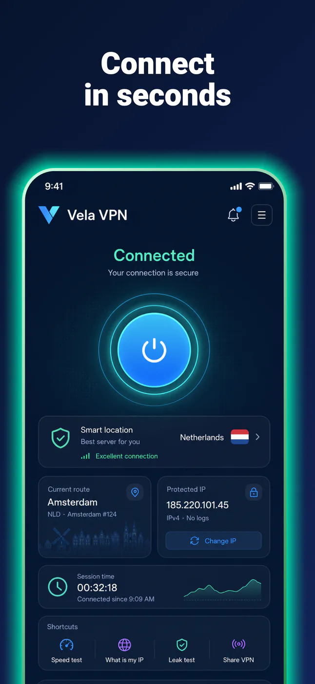
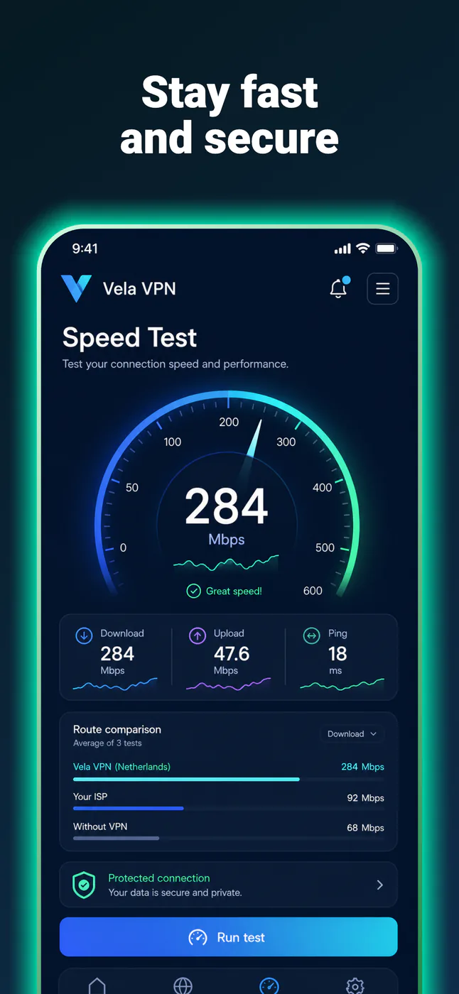
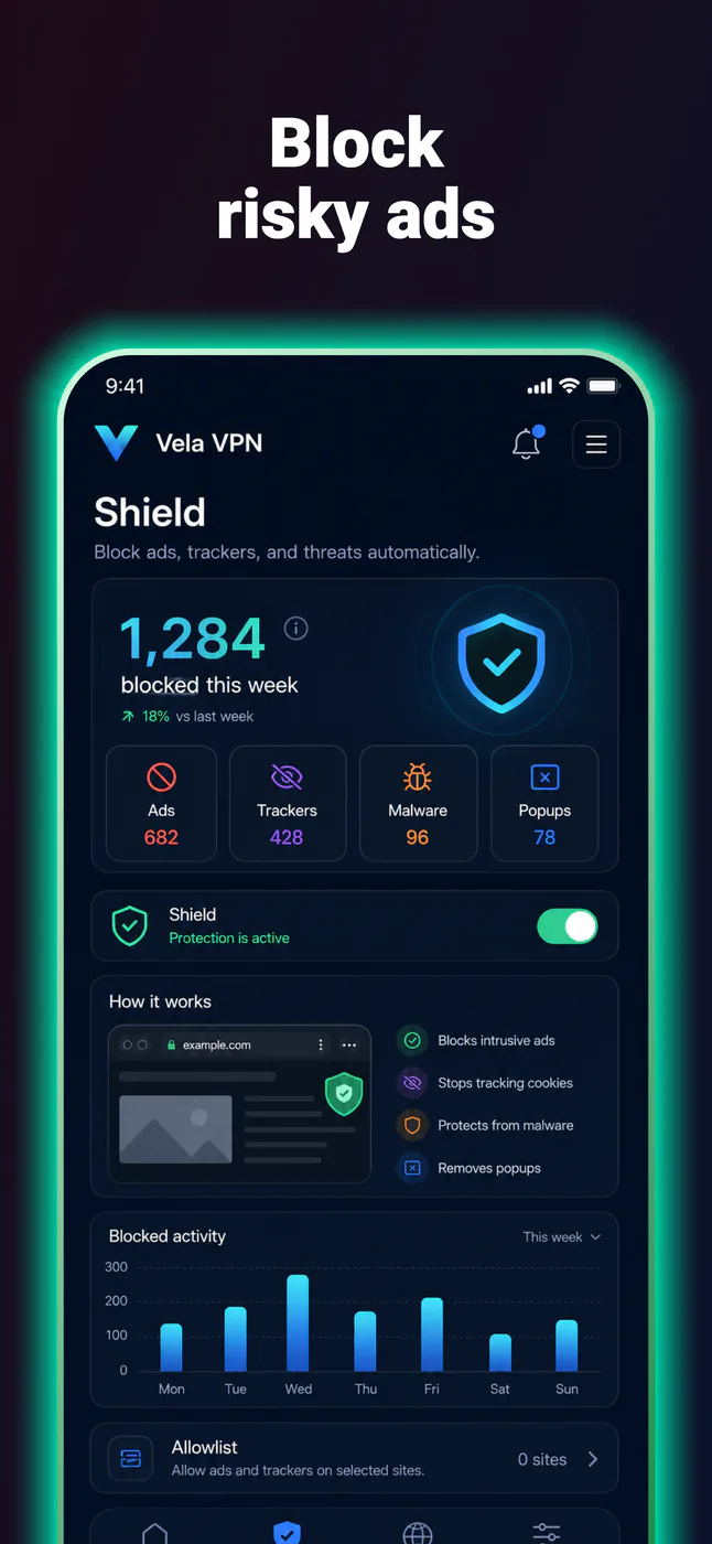
Your first screenshot should communicate one valuable outcome and show the exact part of the app that makes the promise believable.
A clearer first screenshot can make your product easier to understand, but it does not guarantee more downloads. Treat the design as a strong hypothesis, then test it with real store traffic.
Why the first screenshot carries extra weight
Apple allows up to ten screenshots. When your listing has no app preview, the first one to three images may also appear in App Store search results. Apple therefore recommends using those early images to highlight the essence of the app.
That makes screenshot one more than the first slide in a gallery. It may be the only piece of your visual story someone notices before deciding whether to open the product page.
1. Choose one outcome, not a feature inventory
Start with the reason a person would want the app—not the name of the screen you happen to be showing. “Workout tracker” labels a category. “Know exactly what to train today” describes a useful outcome.
This is a practical heuristic, not a universal copy formula. The strongest message depends on your app, audience, acquisition source, and locale. The useful constraint is simply one primary idea per screenshot.
2. Pair the promise with visible proof
If the headline promises a personalized training plan, show the training plan—not a splash screen, login form, or unrelated dashboard. The interface should make the headline feel true before someone reads supporting copy.
Apple requires screenshots to reflect the app’s core experience accurately and says they should show the app in use. Text and image overlays are allowed, but they should explain the product rather than hide it.
3. Build a hierarchy that survives thumbnail size
Give the eye a predictable order:
- The outcome-led headline.
- The app screen that proves it.
- The background, frame, and decorative details.
Reduce the design to store-card size. If the main message and focal UI disappear, they are too small. Increase contrast, crop closer to the useful interface, or remove competing decoration. A beautiful composition that needs zooming is not doing its job.
4. Make the first three images a small story
Screenshot one should earn attention, but it does not need to explain the entire product. Use the first three positions as a compact sequence:
Outcome
The main result the user wants.
Proof
The core workflow that produces it.
Difference
Why this app is the better fit.
5. Remove the mistakes that weaken a first impression
- Several headlines competing for attention.
- Raw UI shown so small that its proof is unreadable.
- A device mockup dominating the product inside it.
- A splash, login, or logo screen without useful app experience.
- Claims, awards, rankings, or numbers you cannot verify.
- Real personal information, notifications, or placeholder data.
6. Localize the idea, not only the words
A translated headline may become longer, change emphasis, or need a different example. Apple supports localized screenshots, so re-check line breaks, visual hierarchy, and the proposition itself for each important market rather than dropping translated text into a fixed layout.
Source: Apple: Localize App Information
7. Test the opening message instead of declaring a winner
Apple’s Product Page Optimization lets you compare alternate screenshots and review conversion results in App Analytics. A useful first experiment changes one primary variable—such as the opening value proposition—while keeping the rest of the visual system stable.
Decide what success means before the test, allow enough traffic to reach a meaningful result, and be willing to accept an inconclusive outcome. Your audience’s behavior is stronger evidence than a design trend.
Source: Apple: Product Page Optimization
A completely free tool
How AppScreenie helps you put this into practice
AppScreenie is completely free to use and does not require an account. Start from a blank store-sized canvas or an editable template, then build the complete screenshot story in one browser workspace.
- Place your real app screen inside an iPhone, iPad, Android phone, or Android tablet mockup.
- Write and adjust the outcome-led headline with loaded fonts.
- Keep every screenshot side by side so the opening sequence stays coherent.
- Preview the store listing, then export one PNG or the complete ZIP set.
Before you export
First screenshot checklist
- One important user outcome is immediately clear.
- The visible app screen directly supports the promise.
- The headline and focal UI survive a thumbnail-size check.
- The design accurately represents the current app.
- No private data, notifications, or unverified claims appear.
- The next two screenshots continue the same product story.
- A test hypothesis is written down before publishing a variant.